
identifying the challenge
Digital content consumption has overshadowed the productive use-case of mobile devices. As addictive social platforms and content emerge on the internet, it is becoming harder to avoid using the phone as a distraction tool.
How might we develop strategies to reduce the influence of digital content consumption on mobile devices, empowering users to utilize their phones more productively and less as a source of distraction?
research insights
Insights from 6 interviewees to understand: “What motivates people to use their phones?”

Work

"I can't go a day without my phone or laptop. All my work meetings and emergency calls are with my devices."
Communication
"My friends and I are always texting on our phones."
Entertainment
"I am barely getting through school and [social] apps help me cope with [the pandemic] and everything else going on in the world."
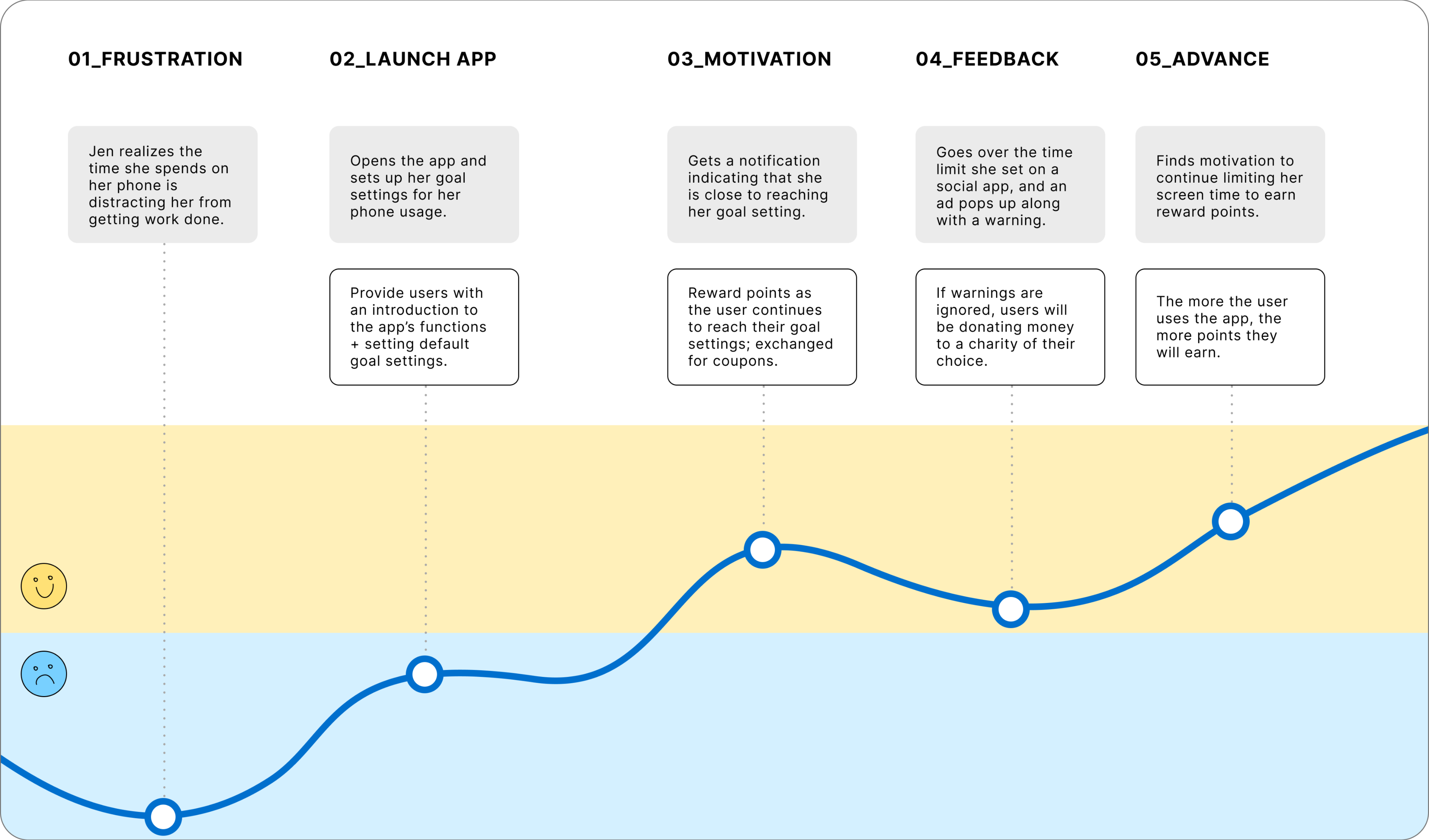
Gaining an understanding of the possible user experience by visualizing the flow.
Challenges in staying motivated to keep phone screen goal settings
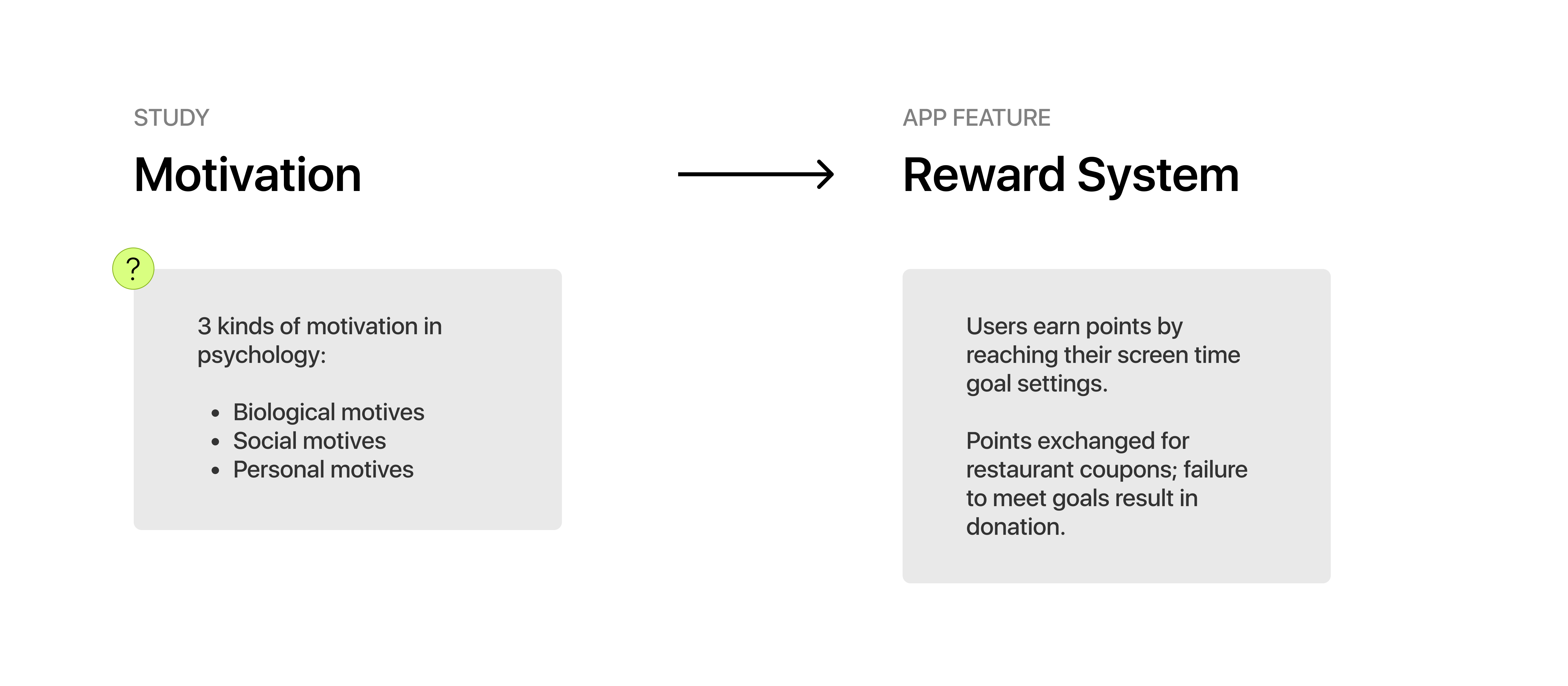
Providing those motivational factors with app features: reward system
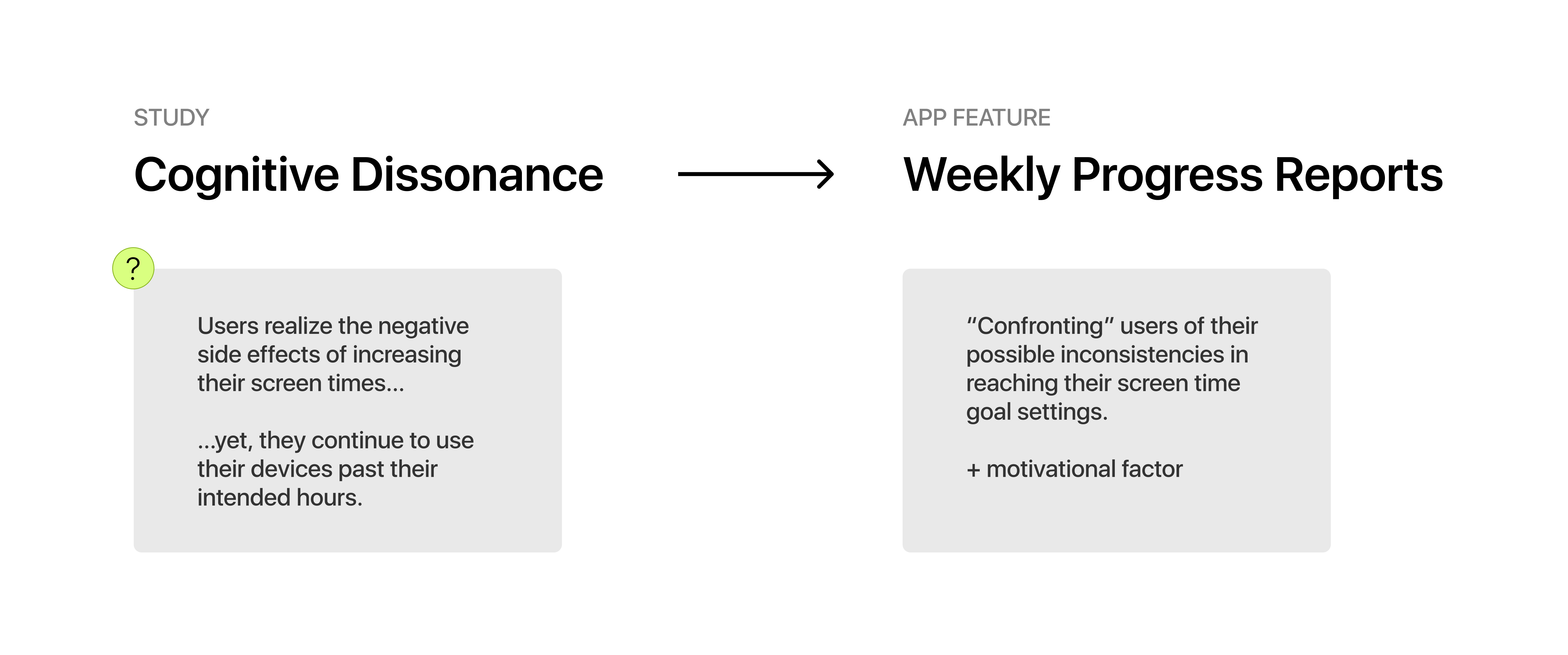
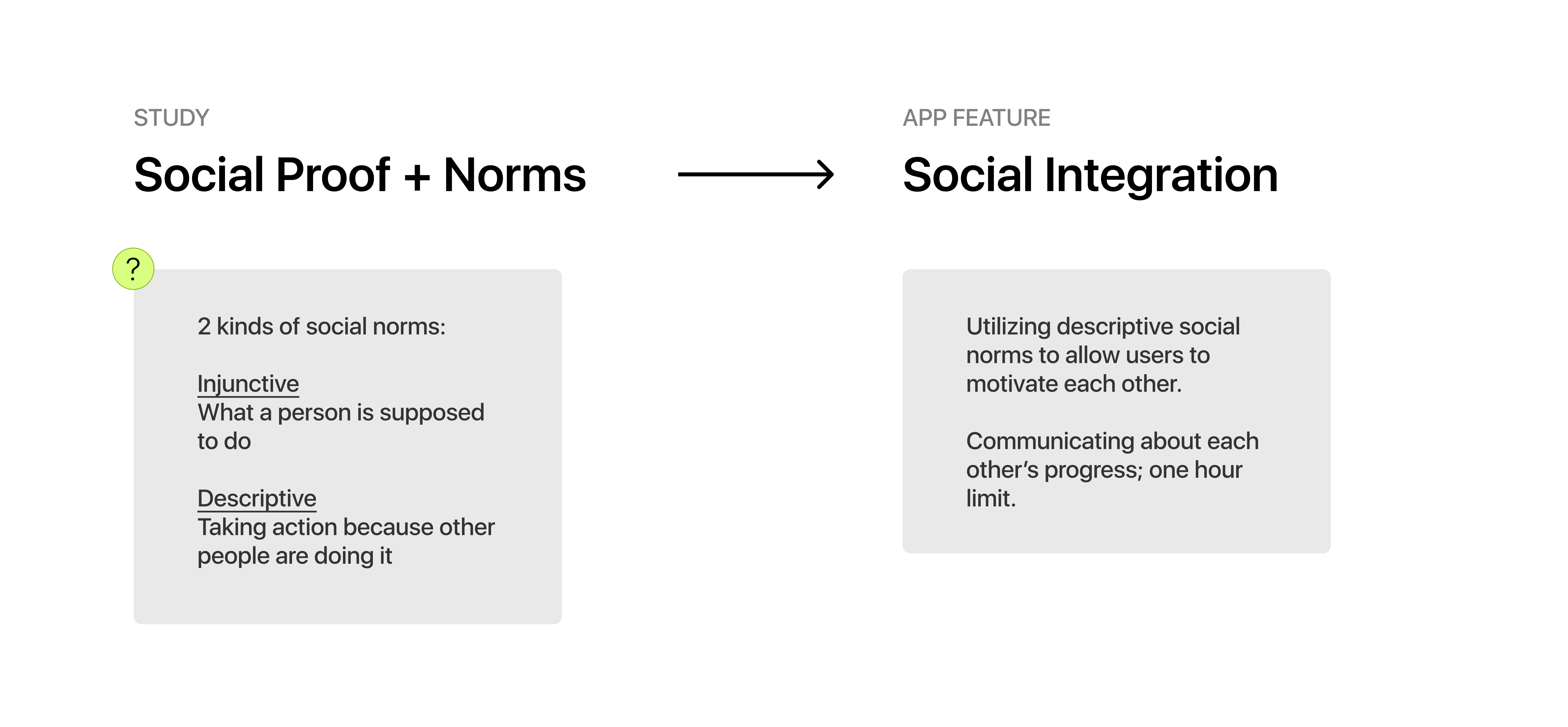
To validate these assumptions, I needed concrete data to advance the feature opportunities I had in mind
Solidifying feature sets that were ideated from the user journey map. Validating decisions based on principles of behavioral economics.
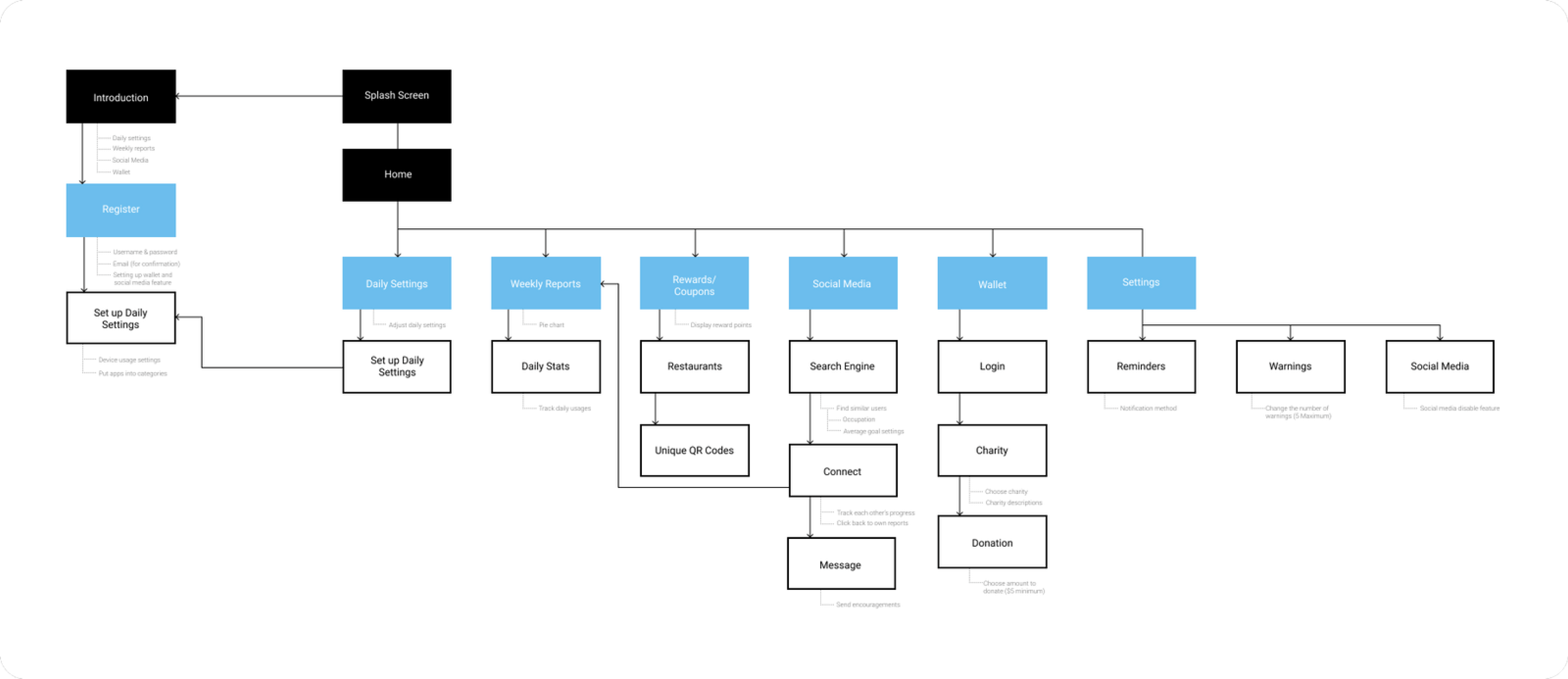
information architecture
Organizing the feature set into appropriate sections of the app; understanding the task flow.
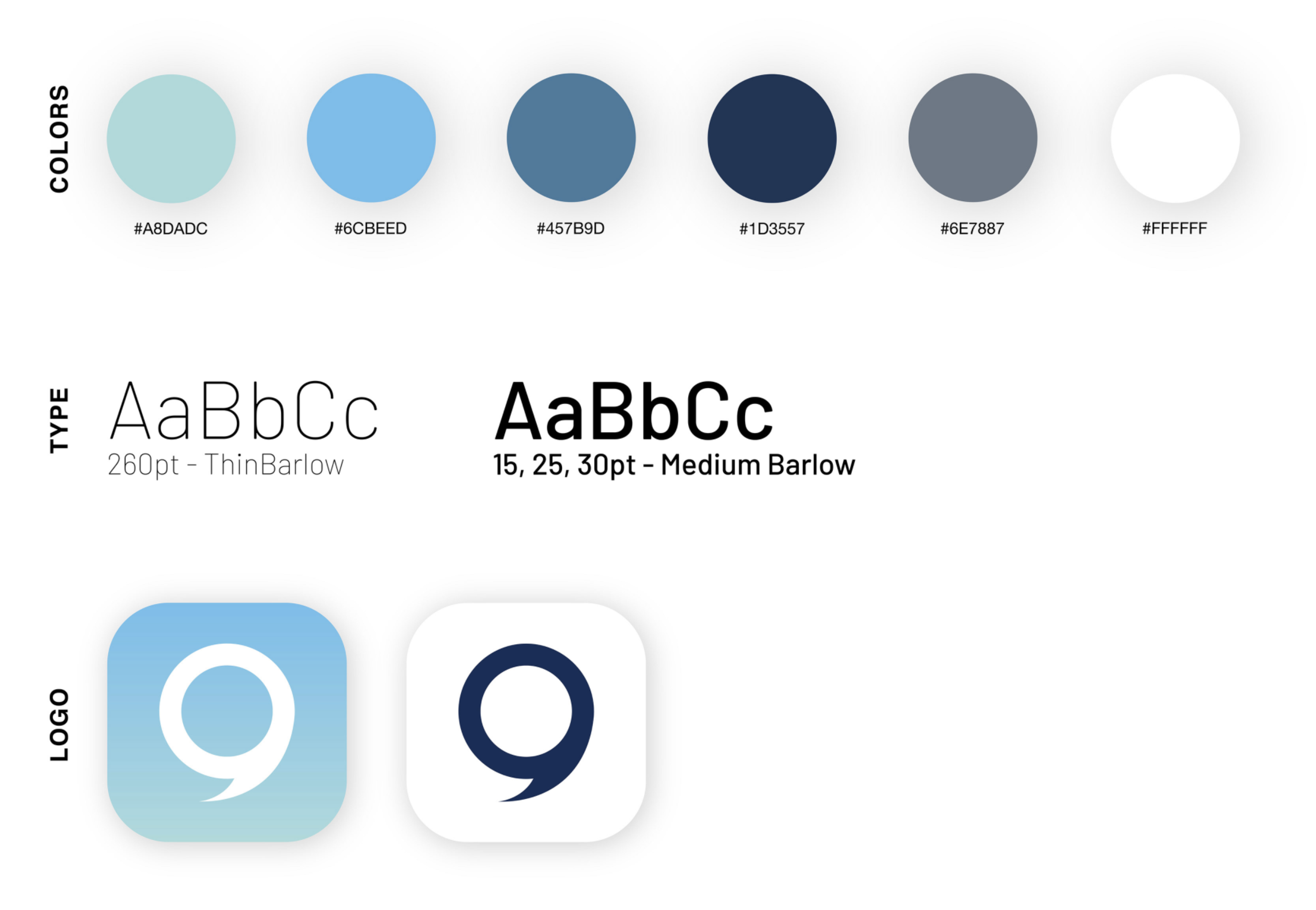
branding
I wanted the users to feel secured and protected with the use of the selected colors.
Blue: sense of security + stability
Green: sense of calmness + endurance
Final thoughts
As my first product design case study, there's plenty of room for improvement in my process and design going forward. Here's what I plan to implement in my next case studies:
Usability Testing:
Given the time frame, I was not able to test out NOMOR's features and receive further feedback. This testing phase would have allowed me to further develop the user interface, as well as provide valuable feedback to make adjustments to the functionality of some of the app's features.
Color Accessibility:
I would account for the colorblind users and acknowledge color contrast accessibility. For instance, the white text on top of the light blue may be hard to read for users due to its low contrast levels. Next time, I will make sure to utilize tools such as
usecontrast to improve the color accessibility issue.


