
identifying the challenge
When I joined New Relic during a company-wide rebrand, the company aimed to raise the homepage user conversion rate from 5.4% to 8%. With new design elements at hand, I had the opportunity to explore and rework the homepage UI to help achieve this goal.

Current user conversion rate from homepage: 5.4%
Goal user conversion rate from homepage: 8%
Original homepage before the redesign:

research insights
Given my time constraints and the need to maximize resources, I conducted my initial research by analyzing the most accessible quantitative and qualitative data at the time: heatmap and Google Analytics.
01. Heatmap Analysis
By studying the heatmap of the homepage (through Crazy Egg), I was able to visually identify design opportunity areas:

Found two main areas for improvement, both located at the bottom of the hero section.
(Hypothesis: The arrow-style color blocking design and the downward-pointing arrow icon may be suggesting to users that they should scroll down, diverting attention away from the main sign-up CTA button——the user name and email input fields.)

02. Google Analytics
I collaborated with the Strategy Team Lead to understand how to interpret and analyze metrics in Google Analytics. I focused on two key rates for the homepage: the exit rate and the bounce rate.
These two rates helped me understand at which points users were leaving the website prematurely.
(Hypothesis: The higher bounce rate compared to the exit rate suggests that many users leave after just viewing the homepage, even though some do explore further. This may indicate that the homepage is not effectively encouraging users to explore the rest of the site.)

Solidifying Project Scope + Goals
After identifying problem areas and opportunities for improvement, I solidified the project goal: to design a homepage that helps users understand the product New Relic has to offer, along with its capabilities. A secondary goal was to provide a more seamless user experience, allowing users to grasp the product and its features efficiently and effectively.
"How might we leverage existing and/or new components from the design system to enhance the user experience and increase the sign-up conversion rate?"
Design solution ideation
My research indicated that users tend to focus on the bottom of the homepage, so I aimed to redirect their attention to the top half, where the hero section and the main CTA are located.
My goal was to populate the hero section with content that:
1. Provides a quick overview of New Relic's product
2. Encourages interaction with the CTA
Items in the list need to be concise and informative
Content in the list must not distract users from the main goal of action: interacting with the sign-up CTA button
Design Opportunities
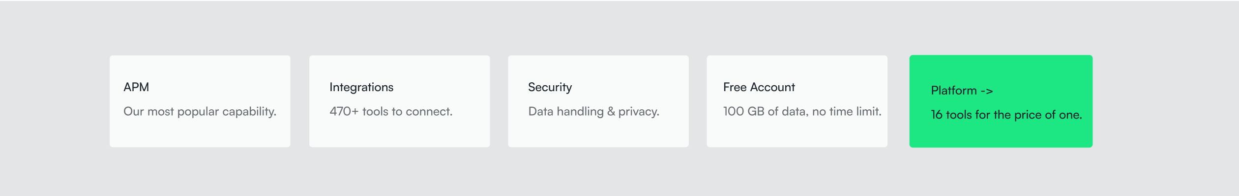
After exploring various design solutions outlined below, I chose to combine the 3 highlighted options——link tiles, icons, and card components——to create a 'quick links' section at the bottom of the hero section on the homepage. This approach allowed me to showcase New Relic's most popular capabilities in a visually engaging and easily accessible format.
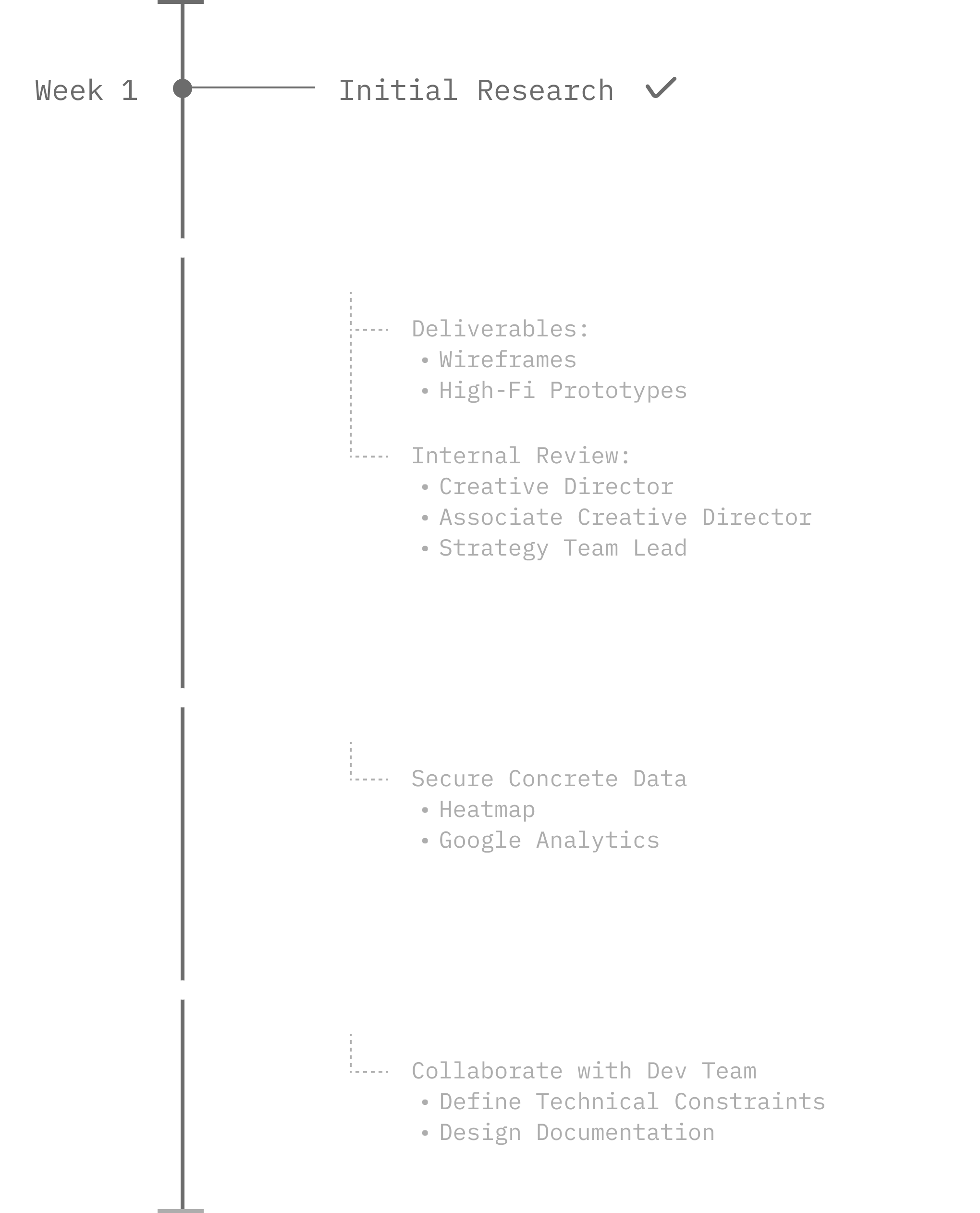
Initial Sketch + Wireframes
.png)
Iterations
I decided to iterate on this design from my initial set of layout and color exploration because this design:
Utilizes New Relic's primary color (bright green)
Uses a neutral color background, which doesn't clash with the rest of the hero section's design
Below is the final design after rounds of feedback and iterations:

A/B Testing
To ensure the new quick links design component effectively increased the user sign-up conversion rate, I conducted A/B testing over a 2-week period and analyzed heat map and Google Analytics results for comparison.
* Please note that I was responsible only for designing the quick links. Any differences in the navigation bar, UX writing, or other elements are the result of design explorations by another team member!
01. Heatmap Analysis (Qualitative Data)
Test variant is the presence of "quick links" on the homepage
More activity within the hero section in variant B, and users showed interest in the quick links

A: no quick links

B: variant, with quick links

A: no quick links

B: variant, with quick links
02. Google Analytics (Quantitative Data)
Recall that the goal for the sign-up conversion rate from the homepage was to reach 8%.
Overall, test B (one with the variant) performed better than test A
The lower exit and bounce rates in test B indicate better user engagement and user retention
.png)
Documentation + Implementation
I successfully executed my goal for this project, which was to:
1. Increase the user sign-up conversion rate
2. Demonstrate the feasibility of implementing the "quick-links" component
Documentation I left the team for the quick link card components:
.png)
Quick link card component nested in the hero section:

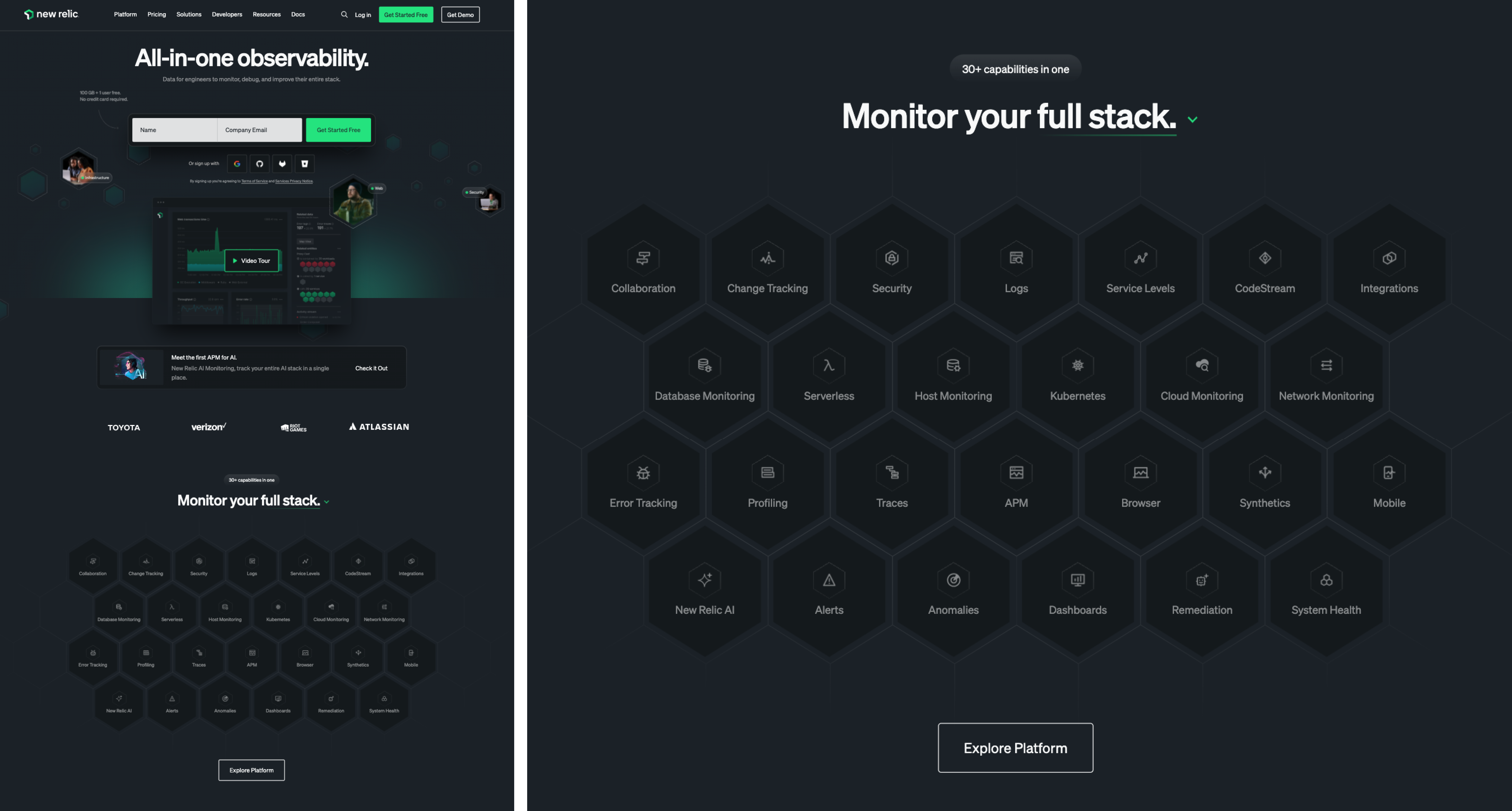
Current New Relic's homepage, utilizing the quick link concept I created:
Final thoughts
During my internship, I aimed to increase the user sign-up conversion rate and demonstrate the feasibility of implementing the "quick-links" component to the team. Despite time constraints, I successfully conveyed to the team that the "quick-links" feature was a viable solution for improving the user sign-up conversion rate.

Design Systems:
I gained my love for design systems through my work this summer. I learned the importance of perfecting each component and being able to create designs that are accessible + applicable to all device screens.
Utilizing Data Analysis:
My mentor introduced me to Google Analytics, heatmaps, interaction recordings, traffic analysis, etc. This helped me further develop my skills in UX research, and a way to create concrete A/B tests.
My Voice as a Designer:
It was very insightful to understand the end-to-end process of taking out/adding in new components to the product.


